Tuesday, May 31, 2011

Pages from the Heart's Color Challenge

Color Challenge:
Pages from the Heart is having its first challenge on its blog for anyone who would like to participate. The rules are to create something using a yellow, grey and kraft color scheme. For more info you can read the blog post here. Who knows? Your work might be featured on their blog!


Sample Layout:
Some members of the design team created a sample as a source of inspiration. I made a single page layout and I have to admit it wasn't easy for me to get started. I searched through numerous paper kits that I already had and found that yellow was not the prevalent color choice right now. There were a few in the summer collections but they were too bright, bordering on orange and wouldn't have matched the subtle greys I wanted to use. I finally found one muted yellow piece in a vintage kit along with another cream colored paper which had a bit of grey in the background. For an embellishment I found one yellow flower, and that is how I started. Here is how I ended:

Kevin and I at El Presido military fortress in Santa Barbara
Supplies:
The colors in the challenge reminded me of the colors I saw at El Presidio fortress in Santa Barbara so I knew I wanted to use those photos. Since it is a historic site, the next logical step was to use a vintage paper collection. I mostly used papers from Echo Park's For the Record and one piece from Basic Grey's Black Tie collection, plus a flower from Sassafras Entwined Bloom sheet. 


Echo Park For the Record


Basic Grey Black Tie

Sassafras Entwined Blooms


Embellishments:
I usually like to have three main groupings of embellishments, as termed the visual triangle. I liked the flower with the missing center from the Entwined Blooms set, but the rest of the flowers were too green and I  didn't want to veer too far from the color scheme. I decided to make my own to match the original flower. I punched out circle and flower shapes, layered them and wrapped them with baker's twine so all three flowers has similar characteristics.

Original flower with a brochure drawing center
Another thing I like to do is add photos in unexpected places or find ways to add more photos to a layout. I cut out a small drawing of the fort and a small photo of the soldiers from the brochure and placed them as the center of two of the flowers. That way I added two more photos into the layout but they were camouflaged as embellishments. In total I managed to put 11 photos onto a single page layout.

Recreated flower with brochure photo center
Recreated decorative flower with i-Rock center
The layout still looked too stark at that point, so I punched out some mini-flowers and scattered them around the title, and also arranged them like leaves around the main flower. I used the i-Rock tool to put on the Glam rocks, which are the small silver flower centers. This was a lot easier to affix than punching holes and getting poked by brads.


Inspiration:
Here is the color palette if you'd like to join in the fun. You can see two more samples from the design team on Page's blog. If you'd like to participate, email a photo of your project to our DT leader Andi at ayokleyjessup@gmail.com by June 5th.

Color Challenge
Take care,

Monday, May 30, 2011

Lights, Camera, Action!

Sketchabilities Reveal Day:


It is time for the reveal of another beautiful sketch from Sketchabilities' site plus 20 interpretations of it for your viewing pleasure. This is me and Jenn the night before a scrapbooking convention showing our anticipation of the event. Actually Jenn likes to take jumping photos in front of places she visits, but her photo which I took was too blurry to scrap. Her photo of me jumping turned out okay so that is the action alluded to in the title.


My interpretation of sketch #48 from Sketchabilities

Here is the sketch itself:


Variations:
  • I added an extra photo and lengthened the photo size. 
  • I simplified the background die cut shapes into rectangles since there was a lot of other shapes and movement and I didn't want it to compete. 
  • Instead of rhinestone flourishes, I hand stitched them with metallic thread. I moved the title along side the main flourish, and added journaling to its original place.

Title and main flourish
  • I added an extra string of lanterns because it matched the first word of my title. I fussy cut them from a Jillibean Soup patterned paper, added some Glossy Accents and Stickles on them, and hand stitched a string across the top so they weren't floating in the air. I wanted them to be anchored so I added some decorative borders vertically.
String of lanterns
  • Instead of flowers and hearts, I added a camera to match the second word of my title. I also fussy cut it from a JBS patterned paper. I added Glossy Accents on the lens and viewfinder to make it look more like glass. 
Close up of camera

  • Above the horizontal scallop strip, I added an extra filmstrip paper. To continue the filmstrip design, I cut off the edges and added it to the photos to give those a filmstrip look too. 


Journaling
If you like this layout sketch, feel free to use it and load your creation into Sketchabilities' gallery. 

Thanks for looking,

Friday, May 27, 2011

Sketch Based Projects

I worked on a series of items based on Allison Davis' sketches. If you want a source of inspiration to help you get started on a project, check out her site here. There are single page, double page layouts, card and add-on item sketches plus plenty of examples from her design team members to really get the creativity flowing. Here are my final products:
Layout
Mini-album
Card


 Add-on Sketch:
Add-on cupcake sketch
The first sketch I used was a little cupcake that you can make into an embellishment. The most common usage I saw was to put it on a birthday layout.

I was having frozen yogurt and the store had these cardboard dividers that you place in the cup so you can have two separate flavor combinations that won't mix together. When I saw the dividers, I immediately thought of making a cupcake mini-album. The dividers also had ads on them, so I took a few to use as my pages.

Frozen yogurt dividers

I covered the dividers with patterned papers. For the cupcake wrappers, I crimped the paper first to get the same texture a real wrapper. I then punched out different sized circles and layered them on top for the cake part. I also popped some of the circles with foam adhesive for some dimension. I added some liquid pearls for the icing and a pom pom for the cherry. 


Crimping paper
Cupcake mini-album cover
There were several pages inside with photos from Isaiah's 4th birthday party, but I'll just show you my favorite page. This has Kevin replicating Isaiah's smile. 

Sample page of the album


Card Sketch:
Card sketch

The second sketch I used was this card sketch. The most common usage was to make candles for a birthday card. I saw the shapes as people of various heights. So Kevin and I took a whole series of photos standing at various heights to replicate the design. It was really difficult to take clear photos using the multi-shot self timer mode while moving around. I cut a bunch of the photos out and lined them up on the card. I thought this would be a good card to showcase your kids or your large family. 

                                   
                               Some of our silly photos

We love you this much card
Here is a close up view:


Single Page Layout:
Last but not least, I made a single paged layout with this sketch. Previously in January, I  used this sketch when I was the guest designer and made a layout that followed closely to the sketch. I basically just did a mirror image of the sketch. You can see the full post here.  
Former layout of Nijo Castle
Single Page Sketch

I didn't want to copy myself or make a similar layout so I tried to look at the sketch from another perspective. I rotated it 90 degrees and interpreted the stripes as piano keys. I took a series of photos of Isaiah trying out the instruments at church. Of course, he liked the drums the best.  

New single page layout
I made the keys from white and black cardstock, rounded the corners and popped up the black keys. Here are some close ups:


You are a (ringo) star layout


Take care,

Monday, May 23, 2011

Pop-up Card Tutorial

I received a request from Pages from the Heart to write up a tutorial about a pop up card I made for them that is currently displayed in the store. I remade the same type of card but changed up the look to give to my brother-in-law at his big 4 uh-oh birthday bash this weekend. 


Pop-up Card Tutorial:
This is a great card if you want to give something a little different as a gift to your friends. It mails flat inside a standard A-2 size card envelop but then pops up with its own built in stand. It makes a perfect housing for a photo, gift card or sentiment. The card construction idea came from Splitcoaststampers which you can also access here.

The card can pop up with its own stand.

The card can also be folded completely flat.

1. Pop up tag - Construct a tag starting with a piece of paper measuring 2-3/4" x 5-1/4". From there you can be creative using more papers or other fun elements from your stash to decorate your tag. Keep in mind the bottom one inch of your tag will be covered so don't decorate that area. Also, try not to use heavy embellishments that will make the card lean back too much and therefore become unbalanced.


2. Card base - This is the trickier part of the card, so please measure and cut carefully for this section. Cut the paper you want for the base at 4-1/4" x 11". I'd use a heavier weight cardstock so your card holds up better. If you want to stamp or emboss your cardstock, now is the time to do so while it is still flat.

3. Scoring - Starting from one end, score at 1", 2-3/4", 3-3/4", 5-1/2", 7-1/4", 8-1/4" and 10". 


4. Slit - To cut the slit where the tag will pop up from, fold the base in half at the 5-1/2" mark. Cut out a thin section 1/2" up from both edges. The darkened rectangular section in the photo below is what you will cut out. It measures 1/8" x 3-1/4". If you use bulkier embellishments, then you need to cut a wider rectangle so your tag will fit.


When you open the base back up, it will look like this.


5. Adhesion - Put your adhesive on both one inch scored sections on each end of your base. It will be on the side of the paper that you want showing.


6. Attachment - Slide your tag into the slit and line it up to the bottom of your base.


7. Completion - Press the two one inch sections with the adhesive together, so the adhesive sections are facing each other with the bottom of the tag in the middle.


8. Finishing Touches - You can decorate the base of  your card further, including tying a ribbon through the base or adding stickers. Or  just leave it as is, especially if you've stamped the base or used a patterned paper. For your viewing pleasure, here are two other cards I had previously made in this style.


This is the one I've previously made
at my mother's request. 
This is the card that is at Pages of my
friend Debby's new baby. 

Take care,

Monday, May 16, 2011

A Quick Jaunt to Santa Barbara

The Layout:
Hi everyone, I've been meaning to share about my mini-vacation to Santa Barbara during Kevin's spring break for a little while now. But all the layouts I made from the photos have to be shown on other sites first, which will post next month. Recently, I made a little layout just for me, that I can finally post.

While we were there, we took a trolley tour around the city and one of the stops was at the Santa Barbara mission. Kevin took some lovely photos. Our school district's letterhead had this motto, "City with a mission" and a picture of a bell, so I was playing with that concept in the title. I know there are many other cities with missions, I was just referencing the San Gabriel's letterhead.

Mission Santa Barbara layout
Here are some close ups:

Doesn't he make such a cute priest?

Using the color capture feature on the camera


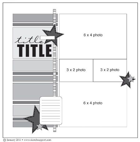
The layout design is based on an Allison Davis sketch, (one page sketch #3) which can be found on Sketch Support.  For the papers, I decided to use a vintage looking collection I bought but never had a chance to use - Crate Paper's Portrait collection. I usually like to use the bright and happy collections instead of more muted, elegant ones. But then I ended up choosing the brightest pieces with the boldest print from the collection, so it wasn't a big departure from my usual endeavors. Oh well, what can you do?


Reflection from the fountain


Crate Paper Portrait Collection


The Accommodations:
While we were there we stayed at a really charming bed and breakfast called The Cheshire Cat Inn.  They had a weekday package that included vouchers to two restaurants for a nice lunch and super fancy dinner, along with the daily breakfasts and evening champagne reception. 

Cheshire Cat Inn
The Alice (in Wonderland) Room
The three course dinner was at Downey's, which has the highest Zagat rating for Santa Barbara restaurants. The food was so good, I'd go and stay at the B & B just to go to the restaurant again. The cost of the dinner was almost as much as a one night stay, so package is very worth it.


Downey's dessert cart

Downey's exterior
The Sites:
The area is so beautiful that you really can't take a bad picture there. I thought the jewel of the city was the city courthouse. The architecture was stunning and you can go to the roof top and see the whole city. A lot of people get married there, like my friend Becky. 


Santa Barbara Courthouse rooftop terrace

Courthouse staircase

The Doggies:
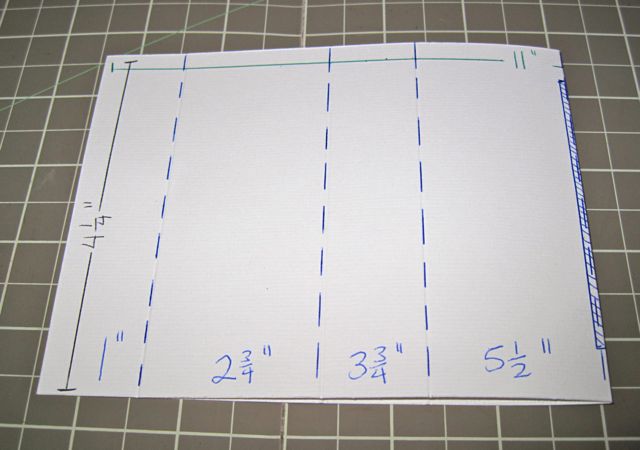
Whenever we go on a trip, I always worry about the doggies being left at home. Two of our former volleyball players came by and took care of them. The dogs wrote thank you cards to them and included a gift card inside. The card opens from the middle so their heads are on one side and their paws on the other side, and it is fastened closed with velcro.

Doggie thank you card
Inside of card
Aren't they so cute?

Thanks for reading this long post.
Take care,