I worked on a series of items based on Allison Davis' sketches. If you want a source of inspiration to help you get started on a project, check out her site
here. There are single page, double page layouts, card and add-on item sketches plus plenty of examples from her design team members to really get the creativity flowing. Here are my final products:
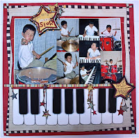 |
| Layout |
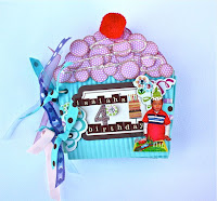 |
| Mini-album |
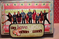 |
| Card |
Add-on Sketch:
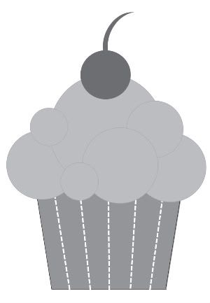 |
| Add-on cupcake sketch |
The first sketch I used was a little cupcake that you can make into an embellishment. The most common usage I saw was to put it on a birthday layout.
I was having frozen yogurt and the store had these cardboard dividers that you place in the cup so you can have two separate flavor combinations that won't mix together. When I saw the dividers, I immediately thought of making a cupcake mini-album. The dividers also had ads on them, so I took a few to use as my pages.
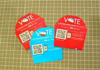 |
| Frozen yogurt dividers |
I covered the dividers with patterned papers. For the cupcake wrappers, I crimped the paper first to get the same texture a real wrapper. I then punched out different sized circles and layered them on top for the cake part. I also popped some of the circles with foam adhesive for some dimension. I added some liquid pearls for the icing and a pom pom for the cherry.
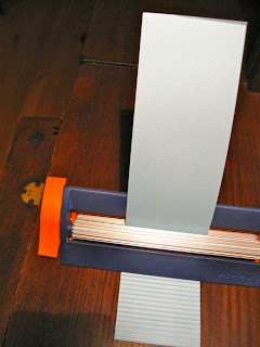 |
| Crimping paper |
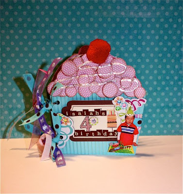 |
| Cupcake mini-album cover |
There were several pages inside with photos from Isaiah's 4th birthday party, but I'll just show you my favorite page. This has Kevin replicating Isaiah's smile.
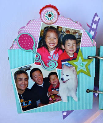 |
| Sample page of the album |
Card Sketch:
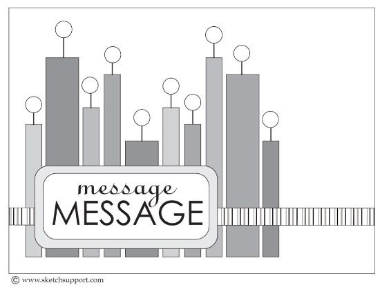 |
| Card sketch |
The second sketch I used was this card sketch. The most common usage was to make candles for a birthday card. I saw the shapes as people of various heights. So Kevin and I took a whole series of photos standing at various heights to replicate the design. It was really difficult to take clear photos using the multi-shot self timer mode while moving around. I cut a bunch of the photos out and lined them up on the card. I thought this would be a good card to showcase your kids or your large family.
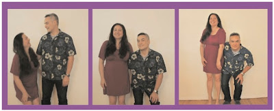 |
| Some of our silly photos |
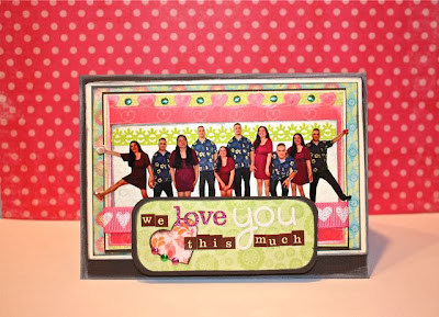 |
| We love you this much card |
Here is a close up view:
Single Page Layout:
Last but not least, I made a single paged layout with this sketch. Previously in January, I used this sketch when I was the guest designer and made a layout that followed closely to the sketch. I basically just did a mirror image of the sketch. You can see the full post
here.
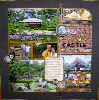 |
| Former layout of Nijo Castle |
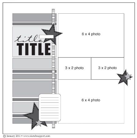 |
| Single Page Sketch |
I didn't want to copy myself or make a similar layout so I tried to look at the sketch from another perspective. I rotated it 90 degrees and interpreted the stripes as piano keys. I took a series of photos of Isaiah trying out the instruments at church. Of course, he liked the drums the best.
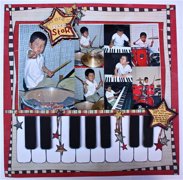 |
| New single page layout |
I made the keys from white and black cardstock, rounded the corners and popped up the black keys. Here are some close ups:
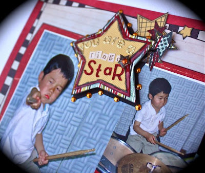 |
| You are a (ringo) star layout |
Take care,








1 comments:
wow, Michelle! so many exciting projects, and all of them are so different and very cool!
Post a Comment