Thursday, June 30, 2011

My Last Reveal with Sketchabilities

The Layout:
I can't believe this is my last reveal with Sketchabilities. I will always have a special place in my heart for my first design team. It was wonderful knowing everyone on the DT and I hope we will meet up again in the scrappin' world.

Here is my layout:

What a Tweet View
Here is Karan Gerber's sketch.

Sketchabilites sketch #50

Stop by Sketchabilities to see all the different layouts by the design team or to link your own version to the blog post. Who knows, you might be featured as the next guest designer on the blog.

The Story:
These are pictures from Kevin's spring break in April when we went to Santa Barbara. I turned in this assignment around that time, so these were my latest pictures at that point. This is the view from the top of the Santa Barbara Courthouse over looking the city. I took several pictures from the same point and I was going to use panoramic merge on Photoshop to stitch it into one continuous picture. After I went home, I realized my version was too old and didn't have this feature, so I just did it the old fashion way with scissors and glue, instead of with newfangled contraptions. 

My own panoramic merge

The three photos of the view are the three from the sketch but I linked them together instead of having them separated. Then I thought it looked a bit empty without some people in the layout, so I added one photo each of me and Kevin. The one he took of me is very artistic as he placed me between the arches and told me to gaze off into the distance. I was playing with the green color capture mode, so the one I took of him on the balcony rail makes him look sickly since only the green is apparent. Oh well, I admit Kevin takes better photos than me. Sorry babe, I did try, you can take the photos next time. I popped up our two photos along the two sides for some added depth. 

Kevin in green color capture mode
The columns are popped up for a 3-D effect
The Details:
I used papers and lace from Crate Paper's Neighborhood collection. It is a soft and subtle and sweet collection. 

Crate Paper's Neighborhood collection
I choose a cream colored background with a scalloped yellow border. I used the border as my inspiration piece for my embellishments. I took some yellow lace, pleated it and glued it in a scalloped pattern like the paper. 

Scalloped lace accent strip

I hand stitched two borders and two salmon colored bows, also replicating the bows in the design.

Hand stitched border and bow


My favorite part of the layout were the circular embellishment clusters. I punched out small details from my courthouse photos. In all, I used 10 photos in a single page layout that has a lot of negative space. I tend to want to put multiple photos onto a layout, the more the merrier right?

Photo embellishments

I'm writing this a week earlier from home in L.A., but on this post date I'm actually on a 6 hour drive from Branson, MO to Kevin's family's house in Wingo, KY. 

Hope y'all are doing well,

Sunday, June 26, 2011

The Start of Summer (& Headbands Tips)

Summer Plans:
I will be traveling this summer to visit my family in Asia and Kevin's family in the mid-west, with a few lil' stops along the way. I mention this as I don't know if I'll have internet access in some of the places, nor will I be able to craft for a month or so. I'll try to post whenever I can, but I don't know if I can be consistent with postings this summer.

I start the first leg of my journey today, as Kevin and I are going to Branson, Missouri to spend a few days with his Dad before heading to his home in Kentucky. Hope y'all have some fun summer plans too.

Kevin and his Dad during our last visit to KY

My Ol' Kentucky home, I'm always amazed by all the pastoral land there.
This is his family's yard. 

Handmade Gifts:
I wanted to leave you with some scrappy goodness before I leave. I made some headbands as gifts recently. It started when my grandmother received a plastic brooch as a gift and didn't want it. I pinned it on a plastic headband and it was really cute. I decided to make a few more that are more embellished to give as gifts during my travels. So Dad, here is a preview of your gift. Just kidding.


Embellished with Brooches
Embellished with Flowers
I started with some plain plastic headbands. On the areas that I'm going to glue embellishments onto the headband, I abraded the plastic with my D-Stress tool. You can also use a Dremel tool. This created more surface area for the glue to adhere to. 

Distressing the areas of adhesion
On the pink headband shown above, I glued on some buttons and clay Plumeria flowers. On the blue headband show below, I only distressed the small areas I was going to glue on a Glam-rock. It is a metallic accent with glue that melts when heated. I used my I-Rock tool to heat it, you can also use a soldering iron.

Heating on the Glam-rocks

I modeled the finished product, hope the recipients won't mind. I'm sure it would look better on some cute little ladies I know.
Enameled butterfly brooch

Clay plumeria flowers
Silk and tulle flowers
Hope to talk to you all soon.

Take care,

Thursday, June 23, 2011

A Tribute to Cindy

Undeniably Cindy
Last photo of Cindy (black dog)
I wanted to make a better tribute page to Cindy, my little loyal friend who passed away a few years back. I felt a bit undeserving of her fierce loyalty. She'd follow me from room to room and spring into action at any sign of a threat. One vivid memory I can recall was when she was sprawled out in front of my bedroom door, like she was asleep. As soon as my dad approached and knocked, she leapt into action, barked and attacked his socks. It make two holes in them too. I thought he would be mad, but he actually admired her alert guard dog behaviors. She did tear up a lot of sheets and socks with her unnecessary protectiveness towards friends and family, but it did come in handy when I was asleep by myself and burglars broke in. Overall, I appreciated her steadfast loyalty. She would be sitting underneath my desk right now as I type this if she was still here.


Top Ten Reasons to Love Cindy
I typed out a top ten list for Cindy. But mostly the reasons show her concern for me and wouldn't endear her to anyone else. Don't get a schipperke if you want a friendly, social dog that can be easily petted by visitors. People could pet Cindy if they followed a set protocol, but mostly people don't want to follow rules, so she just ignored them. But she was sweet to me, and here she is:

In Memoriam of Cindy

The top ten list:

Reasons to love Cindy
The Details
I layered another banner above the banner printed on the paper and overlapped it with the photo.

3-D banner

Here is the title which I hand cut another black layer underneath to create a shadow. I paper pieced a ball to look like the one she would play with when she was a puppy.

Title and embellishments
The Sketch
I found a new sketch site that has weekly layout and card sketches, along with monthly prizes if you link your projects. This is based on Sassy Lil' Sketches, June 14th reveal. 

Variations:
  • I did a mirror image of the sketch because of direction Cindy and I were facing in the main photo. 
  • Instead of journaling strips, I made a journaling block because I had more to say. I replaced two of the background blocks with one larger journaling block.
  • I added three photos in place of the squares. To break up the look, I added some ribbon, twine and buttons to three of the patterned paper squares. 
Cindy was a good little dog. Thanks for looking. 

Friday, June 17, 2011

My Weird Al inspired Foodie Tour Layout

The Layout:
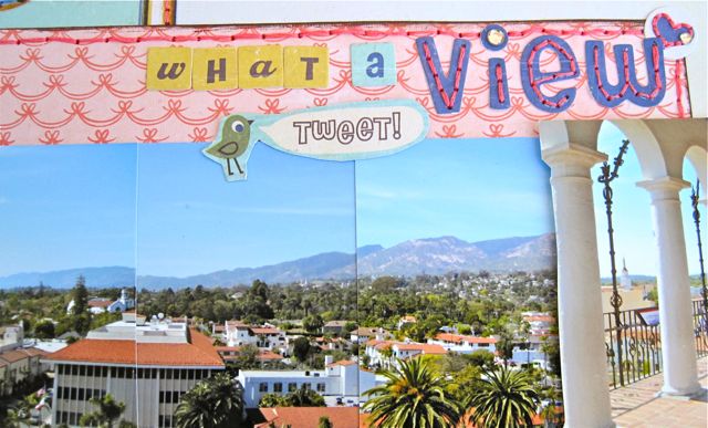
Here is the latest layout I made about a walking food tour Kevin and I took of Old Town Pasadena. We learned a bit about the history, like the Tournament of the Roses parade was started to show the east coast how clement the weather was here in winter and how abundant was the vegetation while the east coast laid buried beneath the snow. But mostly, we visited restaurants and bakeries in the area and received samples. If you are interested, you can get half price tickets through Goldstar here for Foodie Field Trips. They have food tours of many different parts of L.A.

Walking Food Tour Layout

The Challenge:
This was the second item I made with My Mind's Eye Hip Hooray birthday girl collection. I also mixed it with their Portobello Road baby boy collection. There is a sketch challenge running on their blog right now where you have to use their papers, the given sketch and song lyrics in your layout. 

My Mind's Eye sketch

Since I just went on the foodie tour and recently attended a Weird Al concert, I combined the two activities and chose lyrics from, "Eat It." He is one of my favorite singers and before you scoff, like he says, he has lasted longer than most of the people he parodies. 

Weird Al in Eat It

The Details:
Here is a close up of the title. I added another line, "Don't you make me repeat it." 


The title and subtitle

I had some crepe ribbon that was pleated. To mimic that look, I also pleated a banner I cut from patterned papers and layered that on top for the horizontal strips in the sketch. One of the Portobello papers had some stamps printed on it which is at the top of the layout. I recreated the stamps on the bottom of the layout to repeat the pattern. 

Pleated banner, stamping cancellation stamps
For an extra embellishment I popped some cupcakes I cut from paper onto a flag banner I made. We did visit a cupcake bakery on the tour, but I couldn't fit in the photo. I did manage to get 6 photos onto a 2 photo layout by calculating the combined area of smaller photos.

Cupcake embellishment

I was playing around with layering all the pieces and put parts of the photos underneath parts of the patterned papers. Then I journaled in one of the blank spaces on the paper. 

Layering all the pieces
I also cut my background paper half an inch shorter so I could have the other pieces protrude half an inch from my layout and yet still fit in an album.

Coming off the page

Thanks for reading. Hope you will have a great weekend. 

Take care,

Thursday, June 16, 2011

Celebrate Good Times, Come On!

Hip Hip Hooray!
When I was at Pages from the Heart last week dropping off some more projects that I've completed (but can't disclose yet), I couldn't resist picking up a few pieces from My Mind's Eye Hip Hooray Girl Paper Collection. It is their new release birthday collection which has a girl and boy version. I made a cute birthday card and decided to try making a non-birthday layout with it. I'll just be sharing the card today.

Front of card
Inside of card
Here is the collection:

Hip Hooray Girl
Hip Hooray Boy

The Challenge
I decided to use the papers in a My Mind's Eye card sketch challenge that is happening on their blog now. You have to make a card using their products while following this sketch and incorporating song lyrics of your own choosing. 

Challenge Sketch

The Process
When I saw the circles, it reminded me of some clear plastic packaging I had for some embellishments.  I decided to use the packaging and make a shaker card. I hadn't even opened it or used the embellishments, but ended up using the packaging first. Isn't that ironic? 

Plastic Packaging

I punched out a circle on the patterned paper and inserted the packaging through the hole to make a 3-D portal window. I put song lyrics behind two of the windows, and popped up a cupcake on a platter in the third window. This is the back view of the portal where I added the beads. Notice how the micro beads are scattered everywhere on my workspace, that was not by design.

Back view of window

I glued all the pieces together on my card. Hopefully you can see how the window sticks out and you can shake the beads inside to your heart's content, especially to the beat of Kool & the Gang's Celebration, which were the lyrics I used, "Celebrate good times, come on!"

Cupcake shaker

Side view of shaker window


Hope you enjoyed this little card. I'll post the layout with these papers soon. 

Reduce, reuse, recycle.

Take care,

Wednesday, June 15, 2011

Fun with Shadows

The Layout:
Scrap it with a Song blog has a challenge to make a layout based on the Beatles' Abbey Road album cover.  Since I already made this, I decided to enter it.

This layout is based on Sketch #49 from Sketchabilities.

Fun with Shadows Layout
Here is Karan Gerber's sketch:

The Background:
You may be wondering about the photos in the layout... Jenn and I were at the same scrapbook convention as documented in my last Sketchabilities post. When we were walking between the hotel and the convention center, I saw the striped shadows cast from a pergola. I thought it would make interesting photos if we interacted with it. I mimicked the record cover of the Beatles' Abbey Road. I asked Jenn to use her Meisner training to act like a damsel in distress on railroad tracks. Then she wanted to climb up the sidewalk like in a Monty Python skit. So that is the kind of thing we do when we have time between events.

Damsel in Distress

Abbey Road
The Details:
I usually like fun and bold colors on my layout, but in my mind I've been envisioning a black and white one with lots of doodling. The shadow photos matched a black and white color palate so this is the one I decided to try it on. First I antiqued all the photos so it became a soft sepia hue. I printed them twice in slightly different sizes and grouped them together since there is an original object and a shadow.

I looked around my paper collections and pulled out all the black and white papers and embellishments. It ended up looking too stark and too plain so I added some colorful chipboard circles mixed with transparent stickers. I raised up the first and last word of my title which is in a glittery silver and had my middle word in a solid black in the back to create a shadow effect.

Fun with Shadow title
I wanted white lettering on my journaling, so I printed just the background using black and chose white letters which didn't print on white paper, to further play with a shadowy look. 

Journaling strips
That was my attempt to be more artistic, but it is still based on silly photos, so I guess that is just the kind of scrapper I am.

Thanks for stopping by. Look at the fun things you can do with a shadow.

Take care,

Tuesday, June 14, 2011

An Homage to Van Gogh's Starry Night

The Layout
I find I need to challenge myself, otherwise I get bored really easily, lose interest and move on to a new activity. I don't want all my layouts to look the same so I tried experimenting with a new style. I went for a more artsy approach as inspired by Van Gogh's Starry Night. It shows Kevin flying through the night to Hogwarts on his broom. The backdrop was a display at the Orlando airport. We visited Florida last summer to see the Wizarding World of Harry Potter, along with other attractions like the Kennedy Space Center and swimming with manatee.

A Journey to Hogwarts
Here is the original from the master himself:

Van Gogh's Starry Night
The Details
First I  drew the wind and night sky with some colored chalks and pom-poms. Then I layered on top with some wind and stars cut from paper and plastic.

Drawing in the sky background
I glued on some silver stars and a diamond star which was a piece of jewelry I bought at a yard sale for this layout. Finally I added some yellow Stickles glitter glue for the glowing light.

Jeweled star accent
Here is the journaling section.


The layout is based on sketch #159 from Creative Scrappers blog. You can use their sketches and link your layout to the blog post.


This is the double page layout that I made for myself after the trip last summer. If you want to see my whole Orlando album, take a look here. 

Thanks for stopping by,